GalleryPal Design Sprint Case Study
Improving The Art Museum and Gallery Experience
I conducted a modified Google Ventures Design Sprint. To do this, I selected an art gallery and museum-focused Bite Size UX design brief, and began my sprint. I modified my sprint so that instead of taking me apx. 8 hours over 5 days, I spent about 4 or 5 hours working on each day of my 5 day sprint.
The Problem Area:
GalleryPal is a mobile application that individuals can use in art galleries or museums, to help enhance their understanding of and experience with whatever artwork they might find interesting.
Many informational plaques next to artworks do not contain the information a viewer might be interested in, and tour groups do not always allow for an individual to have questions answered about the specific artwork they are curious about. It can also be very time-consuming to have to do thorough research on an artwork or artist using books and articles either before or after a museum or gallery visit. GalleryPal is seeking to address these pain-points with their mobile application.
My Role and What I Did:
I was responsible for accomplishing this GV Design Sprint on my own, and so my tasks included:
Research and User Journey Mapping
Ideation and Sketching
Information Architecture
User Interface Design
Prototyping
User Testing
Day 1 Understanding and Mapping
Research was done to understand the problems that GalleryPal needed help solving for their users. User interviews and an expert interview were reviewed along with GalleryPal’s user persona. According to all of this collected data, GalleryPal user needs were determined, and a direction was chosen for this project.
Angela is the user persona. She is tired of having to read lengthy books and articles before or after gallery and museum visits because it is difficult to maintain her interest for such a long reading. Angela wants to be able to get quick information at the same time as looking at the piece of art that interests her so that she can gain a better appreciation for it, and feel like she has made the most of her visit.
An art and museum expert who was interviewed (by someone from Bite Size UX), said that in her professional experience, it really resonates well with her guests if they understand how and why the artist became an artist and what the unique story is behind an artwork.
She felt that a guest having a good experience and better understanding a piece of art was a combination of them knowing an overview of: Artist background, artwork context (story of the artwork), and how and why the artist had created that piece of art (technique).
The map that I drew to flesh out the best potential way to meet user’s needs included a function where the user can scan a QR code that is associated with a work of art. This allows the app to quickly pull up a brief overview of the artist, the artwork and the technique used to create the artwork.
User journey map from day one.
The overall flow here is fast and straightforward so that the user’s focus can remain on the art in the gallery or museum, and the app can simply facilitate a deeper understanding of the art.
Day 2 Inspiration and Sketching
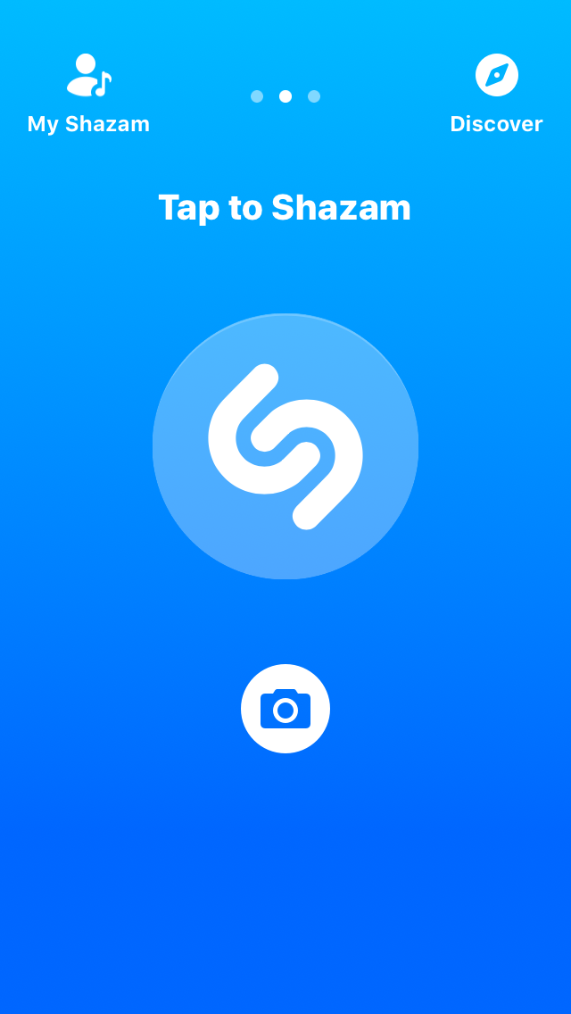
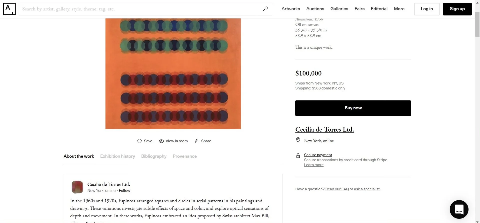
Inspiration was drawn from Artsy.net, Shazam, and WeChat.
Artsy uses a smooth and intuitive display on their artwork detail pages that I wanted to pull from since we knew GalleryPal would most likely have to have an artwork details screen as well.
WeChat has an incredible QR code scanning system. Because I began to visualize a solution to the user’s problem that included scanning QR codes associated with paintings, WeChat seemed like a good place to gain some QR code inspiration.
Shazam utilizes an intuitive and well explained landing page where the user immediately understands what to do without visual clutter. I wanted to learn from this design because the QR code scanning process could potentially be confusing without a proper landing page to orient users and visually guide them into the process.
WeChat QR code scanner inspiration.
Shazam landing page inspiration.
Artsy inspiration for minimal UI aesthetic.
After selecting these inspirations, I determined that the first screen that contained Artwork, Artist, and Technique information was one of the most critical. I sketched out 8 versions of this screen before deciding which solution to choose and incorporate in my first sketches of the basic user flow.
“Crazy Eight” sketches to determine Artwork, Artist, Technique screen designs.
Sketches of three key screens.
Day 3 Decide and Create a Storyboard
After evaluating the sketches from Day 2, I determined how many screens would be necessary to get a good feel for the app as a finished product, and test out the app’s most essential basic function screens.
The decision was made to go with 5 screens that were essential to the app’s primary basic function; A main landing/orientation page, a QR code scan screen for the user to bring up the artwork of interest in the app, and 3 screens that the user would be able to navigate through to give them more information about the artwork that they were interested in.
Wireframe sketches for the GalleryPal red route.
The three artwork information screens would include: One screen with details on the artist, how they became an artist, their primary source of inspiration, their country/culture/time period of origin, and the techniques and media they most commonly used. One screen about the artwork itself, briefly detailing any fun facts/little known info about the artwork, what inspired this artwork/details around it’s creation, and how the artist created it. And one screen briefly detailing an overview of the techniques used in this painting and the techniques used by the artist, explaining and describing artistic considerations of the artist, and the tools they used.
Day 4 Prototyping
On Day 4 of the Design Sprint I began prototyping the wireframes from day 3. My goal as I created this prototype was to create a product that effectively conveyed the core, most important functions of this application. So I steered clear of any details that were non-essential to solving the primary pain points expressed by GalleryPal’s target users.
The focus here was set on screens that allowed the user to find an artwork they were interested in and then study brief important facts about this artwork, the artist, and the techniques used to create it.
I focused on features that would allow the user to navigate between the main landing page, the QR code scanner, and the artwork detail pages.
Hight fidelity wireframes created in Adobe XD before prototyping and user testing.
I selected and then edited a free wireframe kit from Adobe to expedite my prototyping process. Another decision that was made was the color palette. I thought that given the prestigious content featured on this app (fine artworks), purple would be a good color to feature throughout the app. Purple gives a feeling of royalty, intelligence and calm to the viewer. Also, a dark, almost black purple would be good behind light text since it would be easily legible, without creating unnecessary strain to the user’s eyes.
After finishing my designs in Adobe XD, I completed my working prototype using InVision, and began preparing for user testing on Day 5.
Day 5 User Testing
User testing was conducted with 5 users. Users were found by reaching out on social media. Virtual testing sessions were scheduled on Zoom, and users were provided with a link to an InVision prototype of the GalleryPal designs. The 5 users who tested GalleryPal were all gallery or museum goers, with either a background or an interest in art.
Screenshot of prototype screens tested with InVision.
The feedback that stood out from the interviews was:
⅖ Users made a specific comment about how they appreciated the visual impact of the purple color palette and how the regal feeling fit the topic of artwork very nicely.
⅖ Users would have liked the ability to have a better view of the artwork.
Either by fixing the artwork image to the top of the page as they scrolled down…
AND/OR allowing the user to click on the artwork for an enlarged view of the piece.
⅖ Users would have liked to see recommended artworks or artists at the bottom of category screens.
⅗ Users specifically mentioned their appreciation of the chosen categories Artwork, Artist, Technique.
⅕ Recommended to add the artist name to the list of information that is placed in the bottom left hand corner of the artwork image.
⅕ Recommended adding a search bar to the home screen for users who were unable to use a qr code.
Reflection and Conclusion
Going through this modified Design Sprint was a practice in focusing on a set of minimum viable product requirements, without getting bogged down in (currently) unnecessary details. My experience with this sprint was an exercise in prioritization. It proved difficult at times to stay focused on “bare bones”, but ultimately was a worthwhile experience which proved to me the importance of simplicity in design.
Even just with this early prototype, users responded very positively to both the concept of GalleryPal, as well as their overall ability to navigate intuitively from screen to screen.
Moving forward, I would begin iterating on the existing prototype by establishing and implementing critical revisions, based on the above findings from the user tests.


