Maven App Capstone Case Study
The Maven App is a conceptual prototype I created as my capstone project during my professional UX certification program.
The Problem:
The makeup industry in the United States alone is a massive market, without even counting the global makeup industry. Millions of Americans, of every gender and sexual identity, consider makeup a part of their day-to-day lives. However, a hole in this market exists; There isn’t a widely accepted, mobile application specifically dedicated to meeting these consumer’s makeup-related needs.
For a makeup user to access their favorite makeup tutorials and products they must go to multiple different resources located all across the internet.
Top Goal:
I needed to condense product information, makeup tutorials, and a virtual makeup try-on feature within one mobile application for users to access conveniently.
My Role And What I Did:
I was in charge of successfully executing this project from start to finish, making me responsible for:
Market Research and Competitor Analysis
User Research
Solution Ideation
Information Architecture
Wireframing
Product Prototyping
User Testing
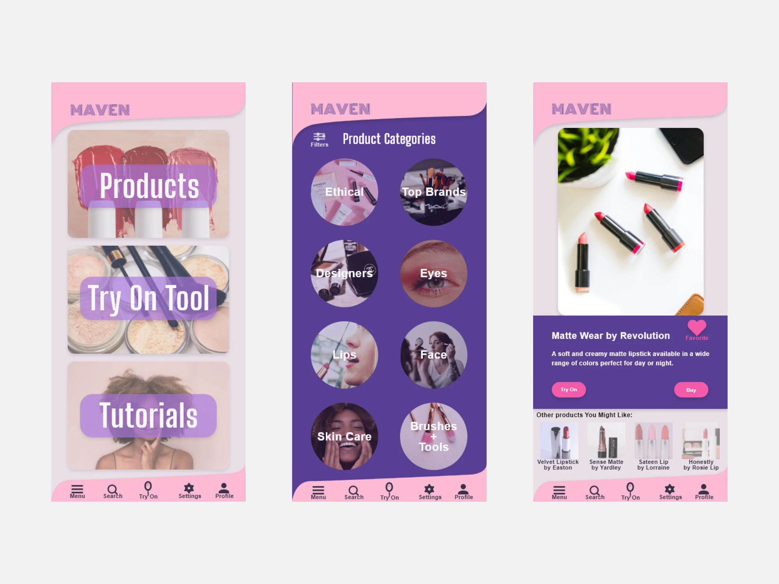
Select screens from the prototype used during round 3 of user testing.
Studying The Competition + Researching The Users
I began by diving into some brief Market research (getting to know the American makeup industry better). Next, using Jakob Nielsen's 10 General Principles for Interaction Design, I conducted a Heuristic Evaluation of two apps and one website that were also focused on the cosmetics community. This Heuristic Evaluation was done to gain valuable knowledge from the usability successes and short-comings of these existing resources within the community I was seeking to design for. Beginning to feel as though I had some useful questions for potential users, I found participants for user interviews.
My goal was to discover how these individuals used makeup in their daily lives, what purpose they felt it served for them, and how their use of it fit into their routines and schedules.
After interviewing seven individuals, and reviewing their input, some patterns emerged.

Affinity Mapping

Empathy Mapping
Two personas seemed justifiable, due to the fact that I had discovered two different motivations among my interviewees.
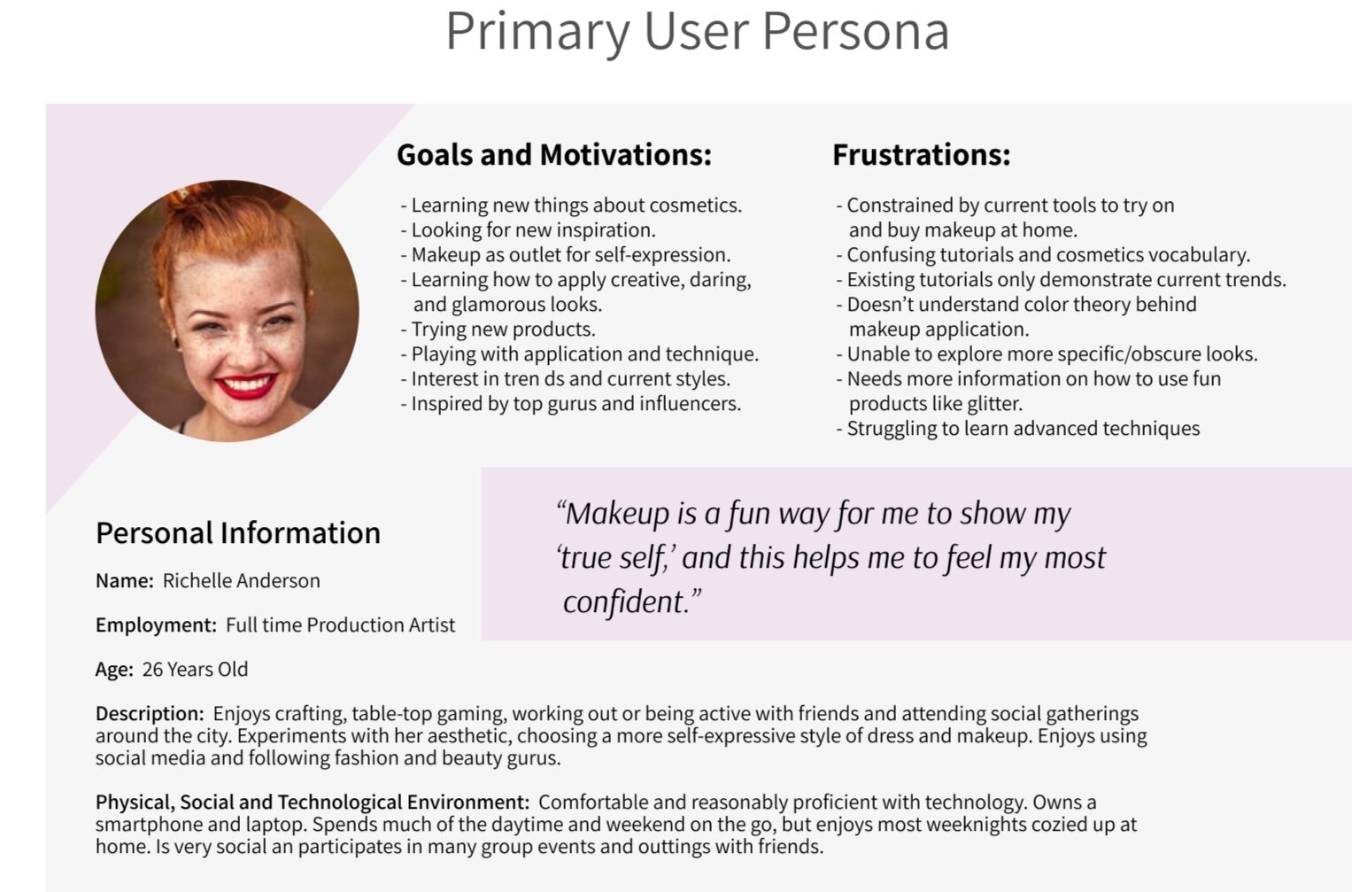
Primary User:
This group of users’ motivation was self-expression. This user became known as the Expressive User. This group is more likely to be open to a wide variety of experimentation with both their products, as well as their aesthetic. While they appreciate it when their makeup is affordable, ethical and conveniently fits into their routine, these are not their main concerns and motivations. These individuals are much more concerned with feeling as though they understand and are part of popular aesthetic trends, and are able to experiment and self-express.
Secondary User:
The other group was motivated by finding products and looks that would fit comfortably into their lifestyle. This user was called the Holistic User. Similar to the Expressive user, the Holistic user is not totally uninterested in creative expression, but it’s not what their main priority is. When this user purchases a product, they are more concerned with the product’s price, ingredients, ethical production process, and effect on skin health.
Something both user groups adamantly expressed was that they wanted a way to test out their products virtually, and they hadn’t yet found a way to do this that worked well for them. They also both expressed frustration with the difficulties they experienced while trying to follow along with makeup tutorials.

After I had talked to my users, I began the process of refining a solution to the main pain-points that had been expressed to me.
The goal here was to utilize various ideation methods and processes to help me begin designing a Minimum Viable Product (MVP). I began by isolating a few key pain-points highlighted from my interviews, and distilling them into “How Might We” questions.

Next, solution ideations were based on these “How Might We” questions. From my solution ideation process, I determined the ‘do or die’ features that my prototypes would need to include, and established that my crucial “Red Route” functions were: Try On, Tutorials, and Products.
Sketching Red Routes and Initial User Testing
I determined my Red Routes by first, creating a Sitemap to determine all the features I would want my app to ultimately have. Next I compared all features to my user interviews, User Personas, and HMW questions to determine three routes that were going to be essential to the basic use and function of this app. From here I roughed out a User Flow of my determined Red Routes.

Maven Sitemap

Maven Red Routes
I then created sketches of my Red Routes, and conducted guerilla user testing on these sketches.
I reached out to 5 potential users randomly and asked them to test out, and give me their thoughts on my initial sketches. Features that multiple users struggled with were what I focused on next. I refined these sketches in my official wireframes and then created a final wireflow, allowing me to even more concretely determined the progression from screen to screen, as well as the direction for the app’s visual design.

Sketches of the Products Red Route, used during guerilla user testing.

Wireflow created after user testing with sketches.
User Interface Design
After establishing how information should initially be organized and creating wireframes based on user tests, it was time to determine visual elements.
A mood board and style guide were created to establish a standard that the visual designs of the app would follow. These design elements were chosen to give a sense of dynamic ‘femininity.’

Maven Moodboard

Maven Style Guide Overview
After establishing an aesthetic direction that I wanted the app to follow, I began creating a first version prototype.

Initial Homescreen Concept Design

Version 1 Homescreen Design

Version 1 Tutorial Screen Design
Color, typeface, font size, and item placement were carefully considered, aligned with Material Design standards, and edited on each screen. The goal was to maintain a dynamic, energetically feminine aesthetic. There was a large amount of necessary information on each screen which presented a challenge when trying to present it in a clean and legible format.
Testing the Prototype
After designing screens for three Red Routes using Adobe XD, the Red Routes were used to create a prototype with InVision. This first round of testing was conducted with four users. Their feedback was collected, assessed, and compiled into categories based on whether an issue was critical, major, minor, or normal. For an issue to reach critical status, two or more users had to express it as a pain point.
Pain points included issues like, recognizability of icons, difficulty scanning information on over-full Try On screens, and problems understanding how specific titles were phrased. Based on findings from user testing, changes were implemented, and revised Red Routes were used in a second round of user testing with 5 users.
During the second round of user testing that was conducted on the revised Red Routes, the 5 new users responded well to the designs overall. Edits to font size, color contrasts, copywriting, icon placements and designs, had all helped the users have a smoother interaction with the prototype.

Version 2 Red Routes used during 2nd round of final stage user testing.

Close up of Home, Product Categories, and Product Detail screens.
Reflection and Conclusion
This project successfully delivered a prototype of a product that the users interviewed and tested were interested in and engaged with. During the refinement of future iterations of the Maven app, I recommend taking the following actions:
Users expressed confusion over whether items displaying a heart icon were already in a favorites list or not.
What can be improved: Redesign these icons so that an outline of a heart is shown for items that have not been favorited yet, and a filled in heart is shown for items that have already been added to a favorites list.
Legibility issues on print throughout the app. Specifically an issue on smaller type.
What can be improved: Adjust type size and color difference for legibility. Evaluate legibility after size and color adjustments to decide if typeface replacement is necessary.
Users expressed confusion over how to select more than one product to try on.
What can be improved: Include a prompt or additional button that promotes this ability. Since it is currently unclear how to access this feature.
In addition to specific adjustments such as those listed above, upon further analyzing the current iteration of the product, it is clear that it better serves the Primary User than the Secondary User. While the Primary User is indeed the Primary User, it would be worthwhile to later research ways in which to better engage with our Secondary User more immediately. Equally engaging with both user personas that were discovered would allow for committed engagement from a larger community, and could be a positive indicator of product growth and customer retention.