
Divvich is a financial social network where investors can connect and learn from each other. Founded in 2019, Divvich’s mission is to change the way individuals invest by improving how they understand their finances.
This brief case study offers a peek into the design process for a few key screens of the Divvich ‘Cash Out Flow’. This was a new feature Divvich was designing and testing to be launched for beta testing in early 2022.
Project: Divvich App (NEW Cash-out Feature V1)
Scope: Redesign written content for intuitive usability. Begin by focusing on missing content. Work up to further refinement of previously written content.
My role: UX Writer
Stakeholders: Lead UX Designer, Lead Engineer
Goal: Launch V1 by March 2022 for beta testing
Challenges: How can we create an informative cash-out process while retaining lean IA optimized for a quick launch?
Basic process: User research > Plan > Iterate > Prototype > Test
Results: Over 50% of users tested preferred the new copy and design updates.

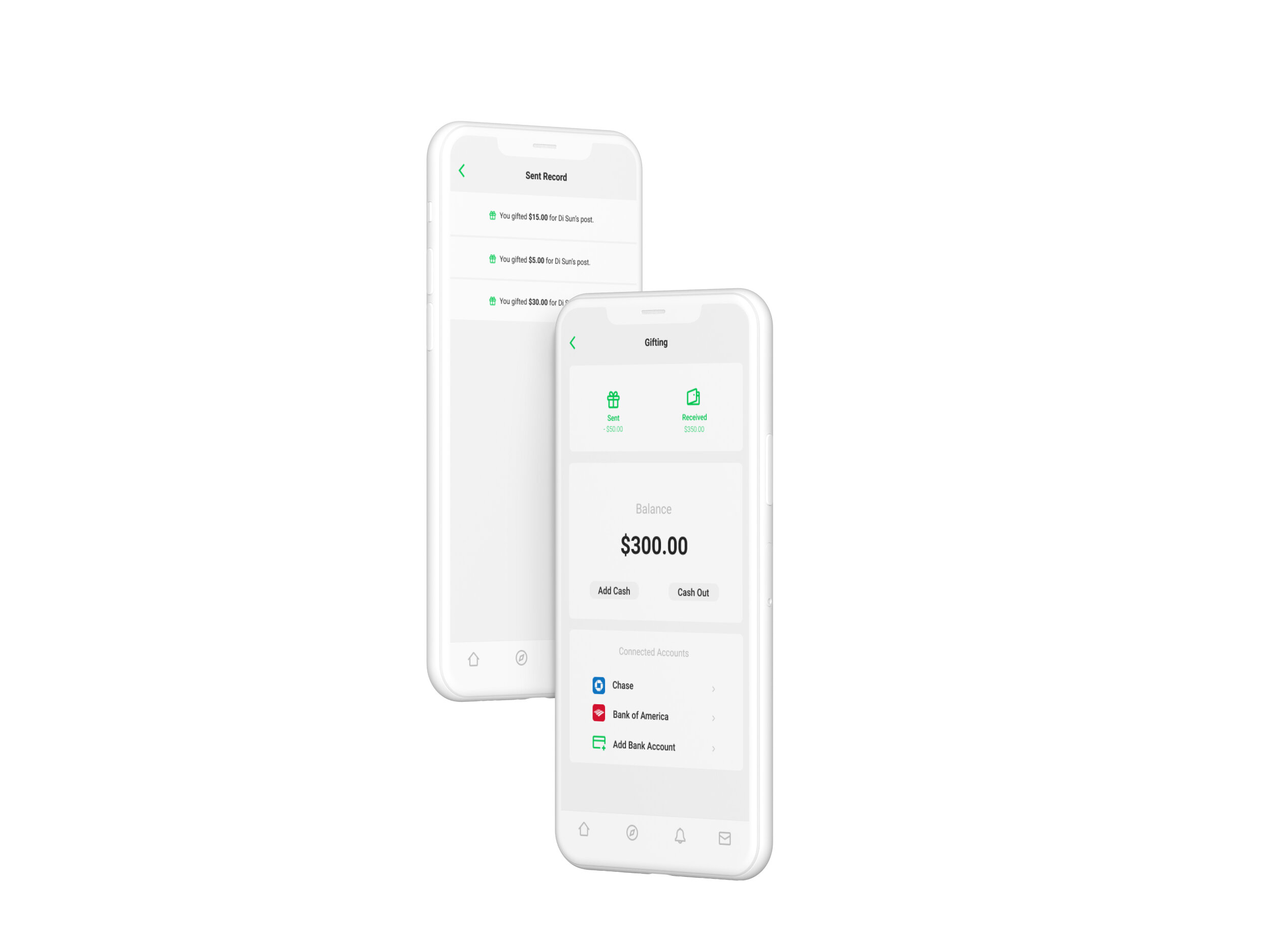
I began by studying the old copy on these key screens:
The screen to the left is missing a heading for the list of connected bank accounts.
The screen to the right is missing a clear heading for the list of cash gifts sent previously.
A concise title will help with ‘skimmability.’
Without a heading, this list of bank accounts is creating a cognitive load for the user. We don’t want the users to have to analyze the content to be certain of what they are looking at.
Good UX Writing is short. But to be kept short it must also be kept clear.
Is this the record of gifts sent or gifts received? Even if the user has clicked on the “Received” button to get here, they should have confirmation that is what they are looking at. This current heading does not give them that.

The First Iteration:
Multiple copy samples were written, and two final selections were made after input from stakeholders.
The screen to the left has a new heading, Connected Accounts.
The screen to the right now has the heading, Sent Record.
Connected Accounts:
This wording was chosen so that it could encompass bank accounts and debit cards.
Users of Divvich are able to send and receive funds using bank accounts. This is done by connecting their preferred debit cards to their Divvich account.
A Heading that provides continuity of wording across red routes associated with users’ sending and receiving funds was crucial.
The wording of, Connected Accounts, is broad enough to be applicable to details related to their bank account or their debit card, yet still clarifies what this particular list is showing.
Sent Record:
This heading provides the repetitive word choice users need.
Sent was the button clicked on the last screen to get here. The heading Sent Record helps you understand where you’ve navigated to and how you navigated there.
User testing was done to test-drive these most recent iterations.
Based on user research findings, UX Designers altered color schemes to accommodate diverse eyesight needs.
User testing found that the improved UX Writing was successful. It was all reasonably good news until the latest updates from our development team...
Leadership had announced that in order to meet deadlines, users would connect bank accounts with account numbers only, not debit card information.
Coding was going too slow for the Gifting feature. This decision simplified the code and design work necessary to meet deadlines.
But it meant I needed to rethink the CTA of the Add Bank Card button.

The Solution:
Even in a high-pressure situation, conciseness, ‘skimmability’, and consistency were key.
I decided to maintain consistency with the Connected Accounts heading that testing showed was working.
Using the wording Add Bank Account in our CTA beneath Connected Accounts gives the user a clear directive, specifies what to expect when they click the button, and stays consistent with the widget heading.
Additionally, user testing had uncovered a need for clarification of the copy specifying amounts gifted.
The old copy did not convey consistency for gifted amounts that included cents and used a decimal point and those which did not.
A decimal point was added to maintain consistency across values, whether they included cents or not.
Gifted amounts were also shown in bold to create a visual hierarchy from other copy, and to promote ‘skimmability.’
The Results:
As of May 2022, further testing and iteration of other screens in the Gifting flow are still ongoing, but the results so far are promising.
To date, user tests of the newest iteration have shown a positive response to UX Writing updates and changes, with over 50% of all users preferring the most recent copy and design.
Lessons Learned:
Keep constant cross-team communication.
Better cross-function communication may have prevented a hurried re-design of how funds for Gifting would be accessed.
Good UX Writing must still be maintained in ambiguity.
During a project experiencing a pivot, it’s hard to stay focused on users. By keeping writing concise, easy to skim, and consistent, UX can be maintained and success metrics met.